Creating a Scatter Graph
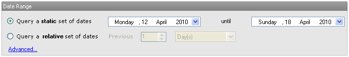
1. Select a Date Range
Choose the time interval for which you want to view data. Click Advanced... to select peak or offpeak data, and other tools for greater control over date selection.
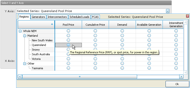
2. Select Data Series
Select the two data series you wish to correlate. Set the desired resolution of the data points (trading period, hour, day, etc). For resolutions longer than a trading period, select the method used to aggregate the raw trading data (max, min, mean, etc).
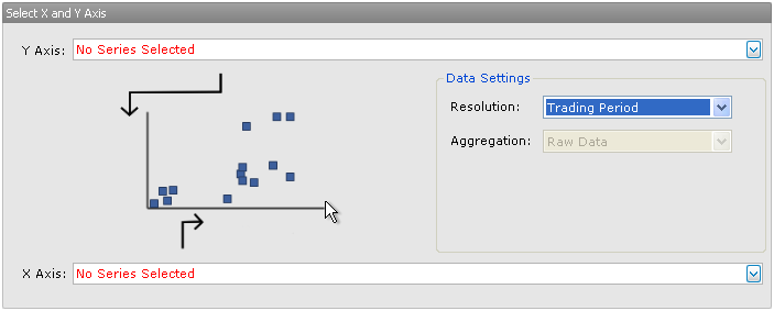
In the drop-down data series selector, hold your mouse over an option button to see a description of that data series.
3. Generate the Graph
Finally, click the Graph View button to generate your graph.

Alternatively, click Table View to view the data behind the graph in a table in NEM-Review. Export To CSV will save the data in a csv file, ready to open in excel for further analysis.
Next, find out how to manipulate your graph or table.