Creating a Distribution Graph
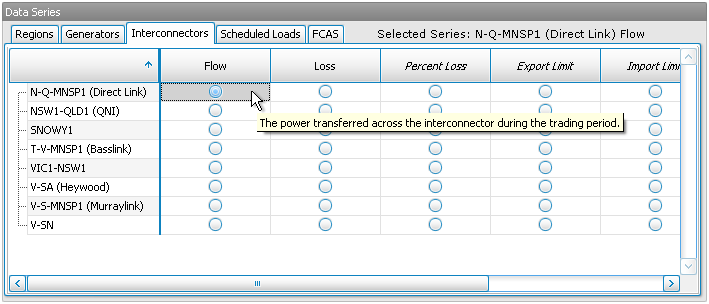
1. Select a Data Series
Select the single data series you would like to display. Hold your mouse over an option selector to see a description of the data series.
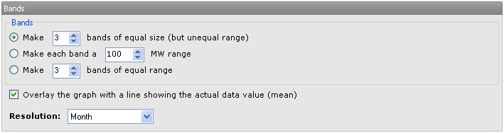
2. Configure Bands
There are three ways to control how the bands (into which data points are distributed) are generated:
- Make x bands of equal size - The range of each band will be automatically calculated so that there are the same number of data points in each band (in total over the selected date range). Each band will cover about the same area on the screen (visually), but the magnitude of the bands may differ.
- Make each band a x (unit) range - Each band will have the specified range, and NEM-Review will automatically add as many (or as few) bands as are necessary to represent the data.
- Make x bands of equal range - The specified number of bands will be created, with ranges automatically calculated so that the x bands will cover the total range required to represent the data. The area on the screen covered by each band may differ greatly.
In this panel you can also choose the resolution of the graph (day, month, year, etc). This controls the number of points along the x-axis.
3. Generate the Graph
Finally, click the Graph View button to generate your graph.

Alternatively, click Table View to view the data behind the graph in a table in NEM-Review. Export To CSV will save the data in a csv file, ready to open in excel for further analysis.
Next, find out how to manipulate your graph or table.